Red Paint: Choosing the Right Shade of Red
Did you know red is the most stimulating color? It boosts energy and appetite, making it great for homes. Picking the right red paint is more than looks; it’s about feeling. It can change your space and make you feel powerful emotions.
In this article, we’ll show how red can add passion, warmth, or class to your home. We’ll help you find the perfect red paint for your walls. It’s all about matching your style and the room’s purpose.
Key Takeaways
- Red paint creates dynamic emotional connections in your space.
- Different shades of red can affect mood and ambience differently.
- Choosing vibrant red paint requires consideration of room size and lighting.
- Testing samples is crucial before committing to a shade.
- Red can be beautifully paired with other colors for a cohesive look.
Understanding the Psychology of Red Paint
Red paint has a big emotional impact. It can change how we feel and see things in different places. The shade of red you choose can make a room feel cozy or exciting. Knowing how different reds affect us helps us pick the right colors for our spaces.
Emotional Impact of Different Shades
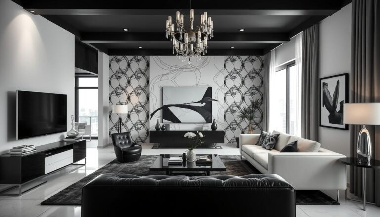
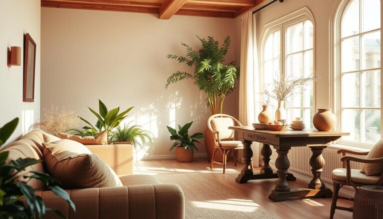
Lighter reds, like coral, bring warmth and friendliness. They’re great for places where people gather, like living rooms or dining areas. Deeper reds, like burgundy, add a touch of luxury and intimacy. They’re often used in bedrooms or dining rooms to create a special atmosphere.
Warm vs. Cool Undertones
Choosing the right red paint means knowing about warm and cool undertones. Warm reds, with a hint of orange, make a space lively and welcoming. Cool reds, with a bit of blue, help create a calm and relaxing vibe. Here’s a quick guide to help you decide:
| Shade | Emotional Impact | Best Uses |
|---|---|---|
| Coral | Warmth, friendliness | Living rooms, children’s spaces |
| Burgundy | Sophistication, intimacy | Bedrooms, formal dining rooms |
| Crimson | Passion, energy | Fitness areas, creative studios |
| Cherry Red | Boldness, excitement | Playrooms, kitchens |
Popular Red Paint Colors to Consider
Looking into popular red paint colors can spark your next home project. Each color has its own vibe, shaping the feel and look of your space. Let’s explore three favorites that can change your home’s look.
Classic Crimson: Timeless Elegance
Classic crimson is a top pick for its timeless charm. It looks great with many decor styles, from old to new. Use it for a bold wall or to warm up a room. It’s perfect for both fancy and casual spaces.
Vibrant Cherry Red: A Bold Choice
Vibrant cherry red is for those who want to make a statement. This bright color adds energy and fun to any room. It’s perfect for kitchens or kids’ rooms, showing off your personality. It boosts creativity and happiness.
Deep Burgundy: For a Rich Atmosphere
Deep burgundy is a luxurious and dramatic choice. It adds depth and class, ideal for cozy spots. Try it in dining rooms or libraries for a welcoming feel. Its warmth makes spaces feel close and fancy.

| Color | Characteristics | Best for |
|---|---|---|
| Classic Crimson | Timeless elegance, warm | Living rooms, dining areas |
| Vibrant Cherry Red | Bold, energetic | Kitchens, playrooms |
| Deep Burgundy | Rich, luxurious | Libraries, intimate spaces |
Red Paint: Tips for Choosing the Right Shade
Choosing the right shade of red paint for your home is a big decision. It involves thinking about several factors. Understanding these elements will help you create the perfect atmosphere in your space.
Consider Your Space and Lighting
Start by looking at your space and lighting. Every room is different. Think about the size and layout of your space. Smaller areas might look better with lighter reds to avoid feeling too crowded.
Larger rooms can handle deeper shades. Natural light greatly affects how red paint looks. A color might look great in daylight but different at night. So, it’s key to check how your space and lighting work together.
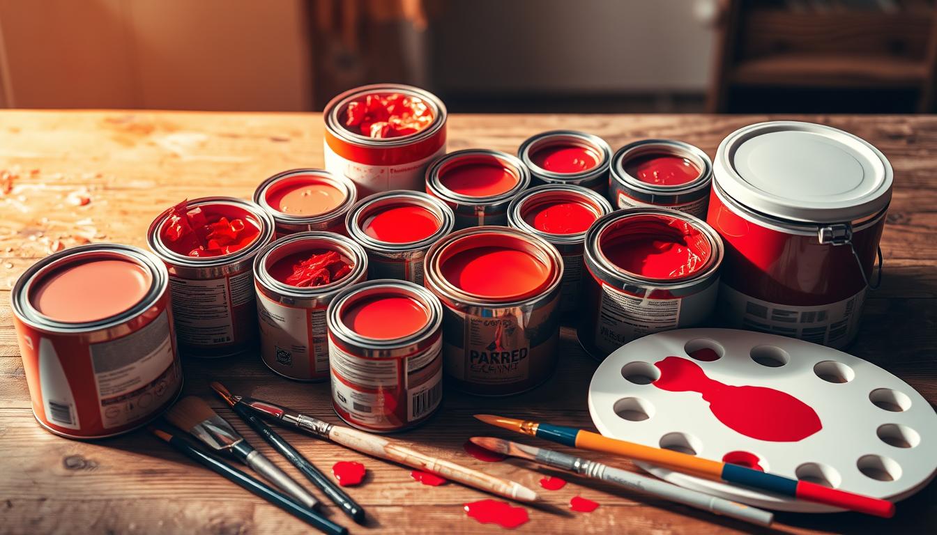
Testing Samples Before Committing
Testing paint samples is a must before making a final choice. Buy sample pots of your chosen colors and paint a small area of your wall. See how the colors look in your room at different times of day.
This approach lets you see how the color will look in your space. It also helps make sure it fits with your design plan.
How to Pair Red with Other Colors
Choosing the right colors to pair with red is important. Think about using colors that complement or contrast red. Neutrals like gray, beige, or white can make bold reds look sophisticated.
For a lively look, try mixing red with blue or green. Remember, these pairing strategies can help create a balanced and harmonious color scheme in your space.

Finding High-Quality and Affordable Red Paint
Choosing the right paint is crucial for a successful painting project. High-quality red paint ensures a beautiful finish and lasts long. Knowing what makes paint quality can help you make the best choice for your home.
Factors to Look for in High-Quality Red Paint
Look for these key factors in high-quality red paint:
- Durability: Choose paints that resist wear and tear, great for both inside and outside.
- Coverage: Pick paints that cover well, needing fewer coats and saving time.
- Finish Options: Quality paints come in matte, satin, and gloss finishes. This lets you choose the perfect look for your space.
- Color Retention: Good paints keep their color, keeping your space bright and vibrant.
Best Affordable Options on the Market
There are many affordable yet high-quality red paint options. Look at these professional red paint products:
| Brand | Product Line | Price Range | Key Features |
|---|---|---|---|
| Behr | Behr Premium Plus | $30-$40 | Excellent coverage, durable finish, low odor |
| Valspar | Valspar Signature | $25-$35 | Fade-resistant color, easy application, stain-blocking |
| Sherwin-Williams | SuperPaint | $35-$45 | High durability, mildew resistant, wide color selection |
Choosing from these affordable yet high-quality red paint options can give you amazing results. Your paint choice is key to a beautiful, lasting change in your space.